
![]()
![]()
I want to make building the best plots as easy as possible. I’ve never really been a fan of incrementally building a plot by calling function after function, mostly because I have to keep going to stackoverflow to get the syntax or flip through entire documentation just to see what’s possible.
This package is intended to reduce or eliminate that behavior (hence the “Auto” part of the name “AutoPlots”). The plots returned in AutoPlots are sufficiently good for 99% of plotting purposes. There are two broad classes of plots available in AutoPlots: Standard Plots and Model Evaluation Plots. If other users find additional plots that this package can support I’m open to having them incorporated.
These plot types are most useful for those looking to evaluate the performance of regression, binary classification, and multiclass models. Designing plots for multiclass models are rather challenging but I’ve abstracted all that work away so the user only has to pass their categorical target variable along with their categorical predicted value, and the plots will display all the levels appropriately without requiring the user to do the data manipulation ahead of time. Same goes for regression and classification, which are easier, but still requires time and energy.
Additionally, all model evaluation plots supports grouping variables for by-analysis of models, even for multiclass models! - Calibration Plots - Calibration Scatter Plots - Partital Dependence Plots - Partital Dependence Heatmaps - Variable Importance Plots - Shapely Importance Plots - ROC Plots - Confusion Matrix Heatmaps - Lift Plots - Gain Plots
Another giant bonus is that the user can either pre-aggregate their data and pass that through to these functions (using PreAgg = TRUE) or they can leave their data in raw form and let my optimized data.table code manage it for them. This means you can develop plots from giant data sets without having to wait for long running data operations. Further, there is a SampleSize parameter in the functions to limit the number of records to display, for the giant data cases (or for scatter / copula plots). This sampling takes place AFTER data aggregation, not before.
install.packages("combinat")
install.packages("data.table")
install.packages("devtools")
install.packages("dplyr")
install.packages("e1071")
install.packages("echarts4r")
install.packages("lubridate")
install.packages("nortest")
install.packages("quanteda")
install.packages("quanteda.textstats")
install.packages("scales")
install.packages("stats")
install.packages("utils")
devtools::install_github("AdrianAntico/AutoPlots", upgrade = FALSE, force = TRUE)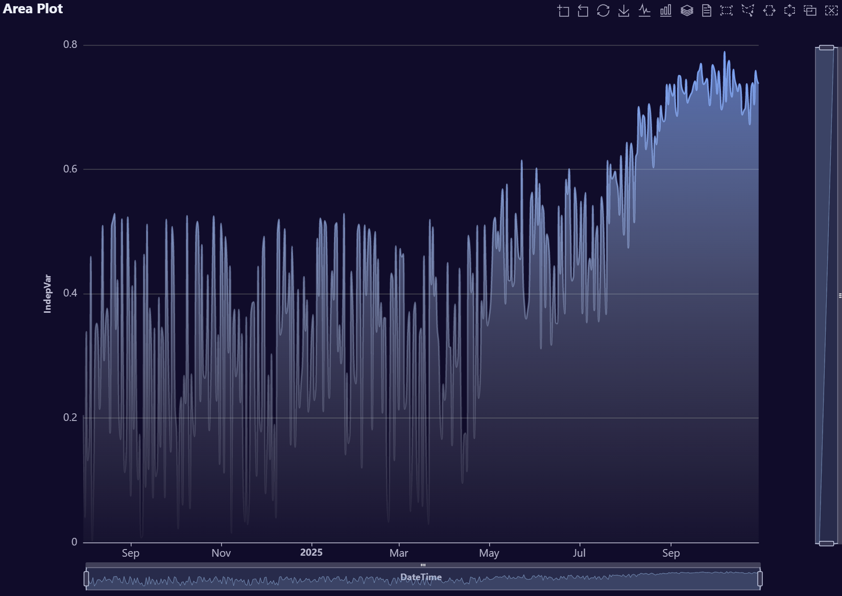
# Create fake data
data <- AutoPlots::FakeDataGenerator(N = 1000000)
# Build Histogram plot
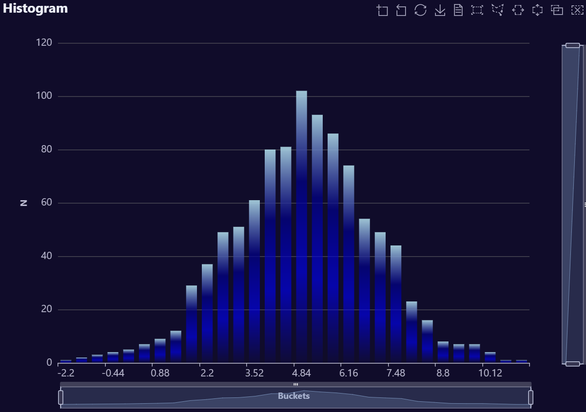
AutoPlots::Plot.Histogram(
dt = data,
XVar = NULL,
YVar = "Independent_Variable4",
YVarTrans = "Identity",
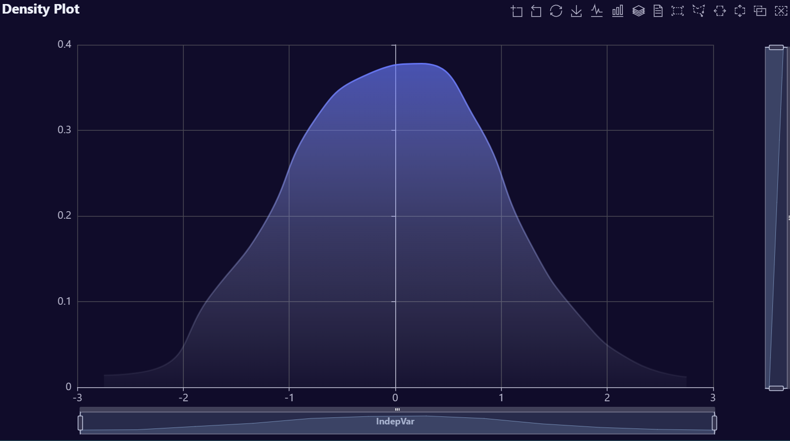
EchartsTheme = "macarons")# Create fake data
data <- AutoPlots::FakeDataGenerator(N = 1000000)
# Build Density plot
AutoPlots::Plot.Density(
dt = data,
XVar = NULL,
YVar = "Independent_Variable4",
YVarTrans = "Identity",
EchartsTheme = "macarons")# Create fake data
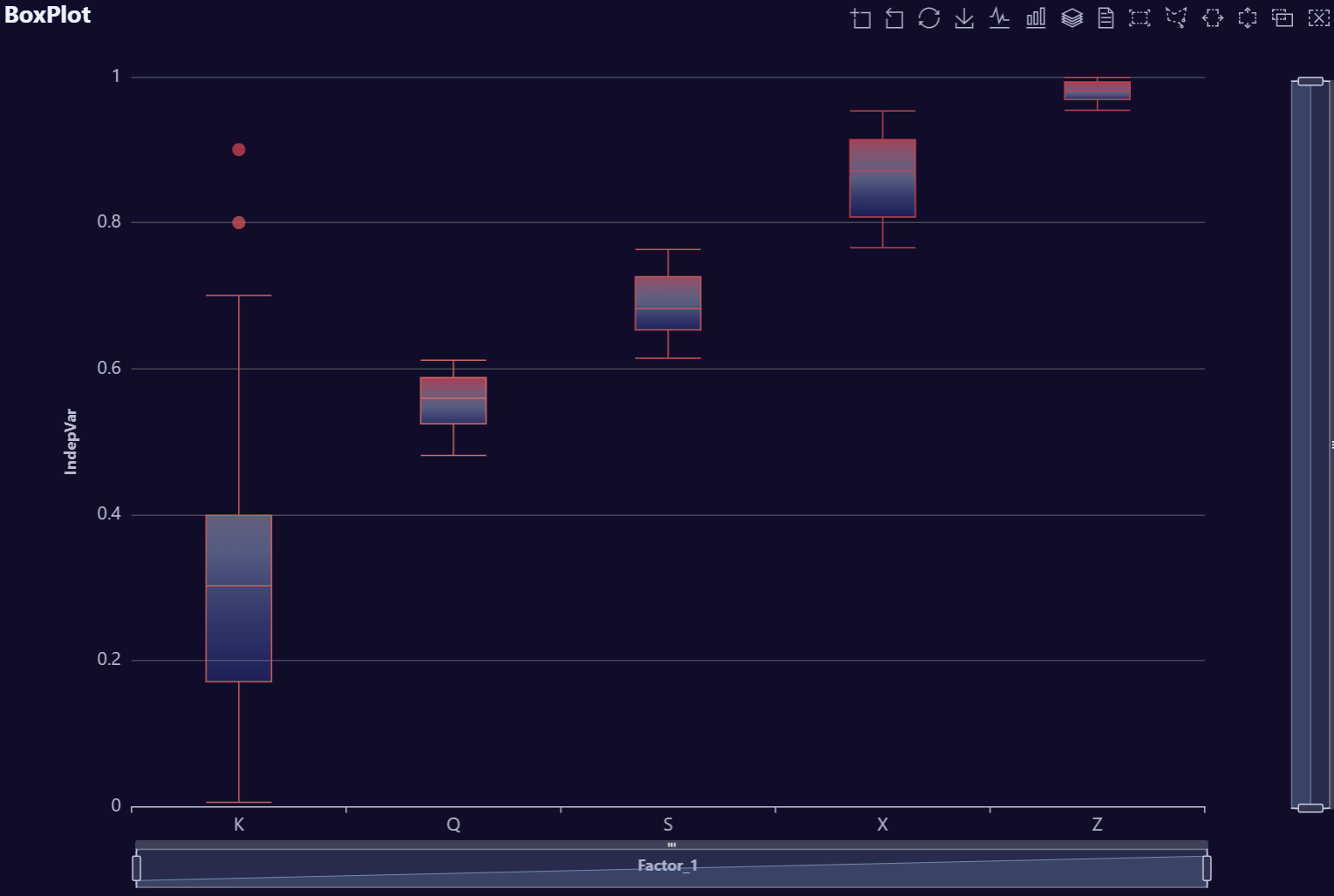
data <- AutoPlots::FakeDataGenerator(N = 1000000)
# Build Box plot
AutoPlots::Plot.Box(
dt = data,
XVar = "Factor_1",
YVar = "Independent_Variable1",
YVarTrans = "Identity",
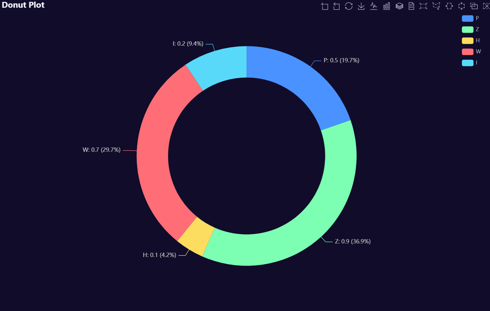
EchartsTheme = "macarons")# Create fake data
data <- AutoPlots::FakeDataGenerator(N = 1000000)
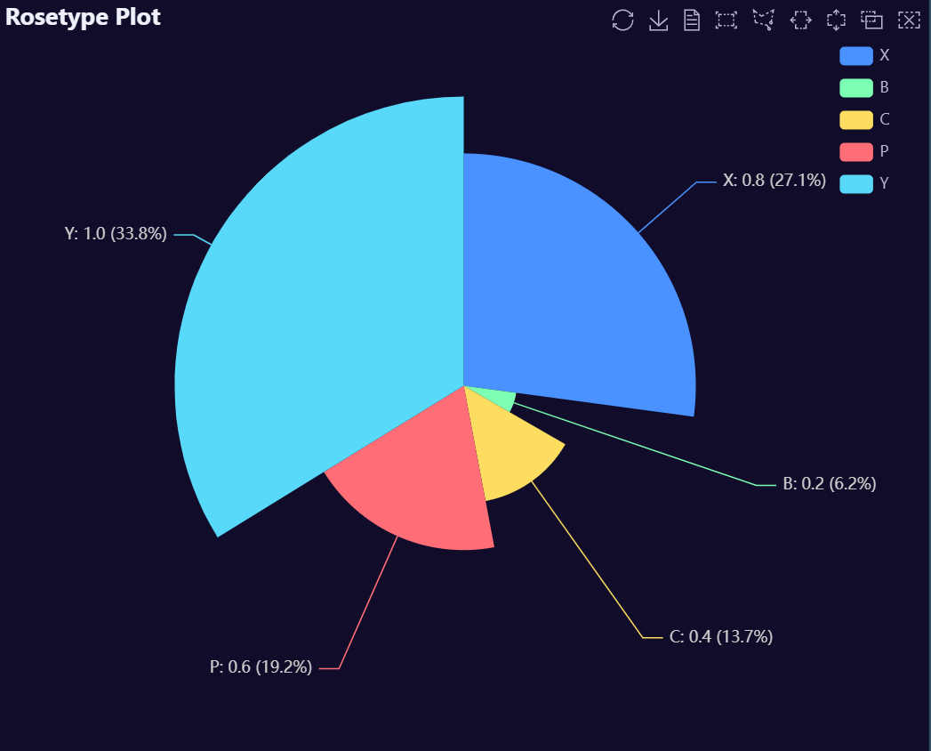
# Build Pie plot
AutoPlots::Plot.Pie(
dt = data,
XVar = "Factor_1",
YVar = "Independent_Variable1",
YVarTrans = "Identity",
EchartsTheme = "macarons")# Create fake data
data <- AutoPlots::FakeDataGenerator(N = 1000)
# Build Area plot
AutoPlots::Plot.Area(
dt = data,
PreAgg = FALSE,
AggMethod = "mean",
XVar = "DateTime",
YVar = "Independent_Variable1",
YVarTrans = "Identity",
EchartsTheme = "macarons")# Create fake data
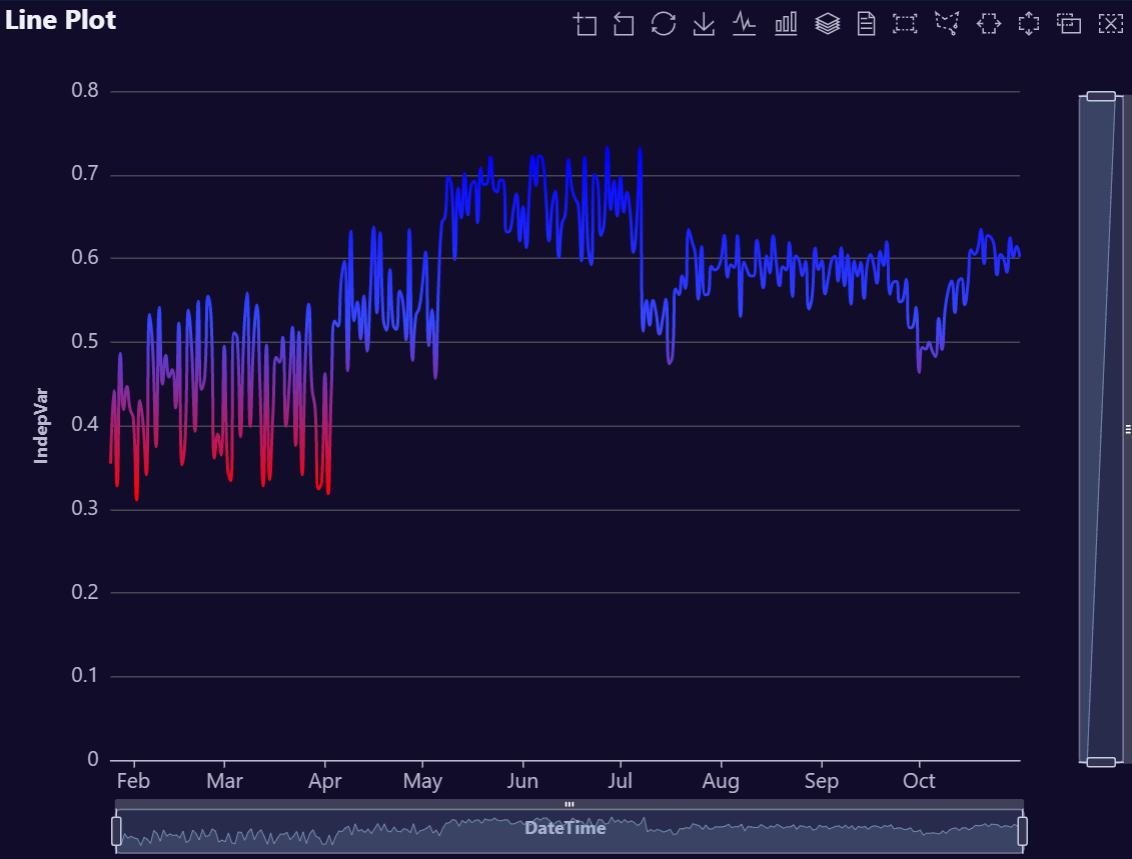
data <- AutoPlots::FakeDataGenerator(N = 1000)
# Build Line plot
AutoPlots::Plot.Line(
dt = data,
PreAgg = FALSE,
AggMethod = "mean",
XVar = "DateTime",
YVar = "Independent_Variable1",
YVarTrans = "Identity",
EchartsTheme = "macarons")# Create fake data
data <- AutoPlots::FakeDataGenerator(N = 1000)
# Build Step plot
AutoPlots::Plot.Step(
dt = data,
PreAgg = FALSE,
AggMethod = "mean",
XVar = "DateTime",
YVar = "Independent_Variable1",
YVarTrans = "Identity",
EchartsTheme = "macarons")# Create fake data
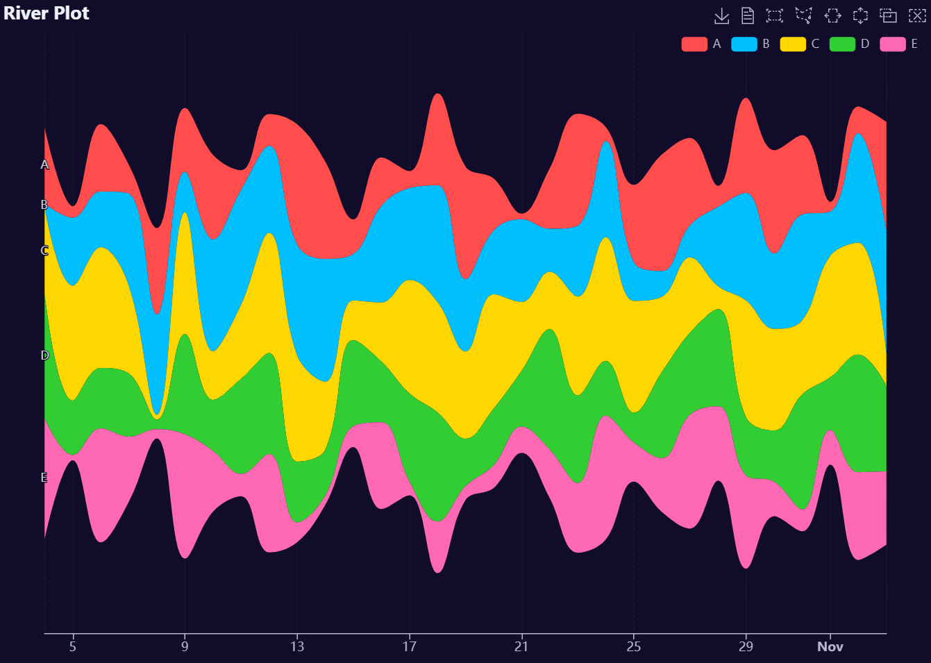
data <- AutoPlots::FakeDataGenerator(N = 1000)
# Build River plot
AutoPlots::Plot.River(
dt = data,
PreAgg = FALSE,
AggMethod = "mean",
XVar = "DateTime",
YVar = c(
"Independent_Variable1",
"Independent_Variable2",
"Independent_Variable3",
"Independent_Variable4",
"Independent_Variable5"),
YVarTrans = "Identity",
EchartsTheme = "macarons")# Create fake data
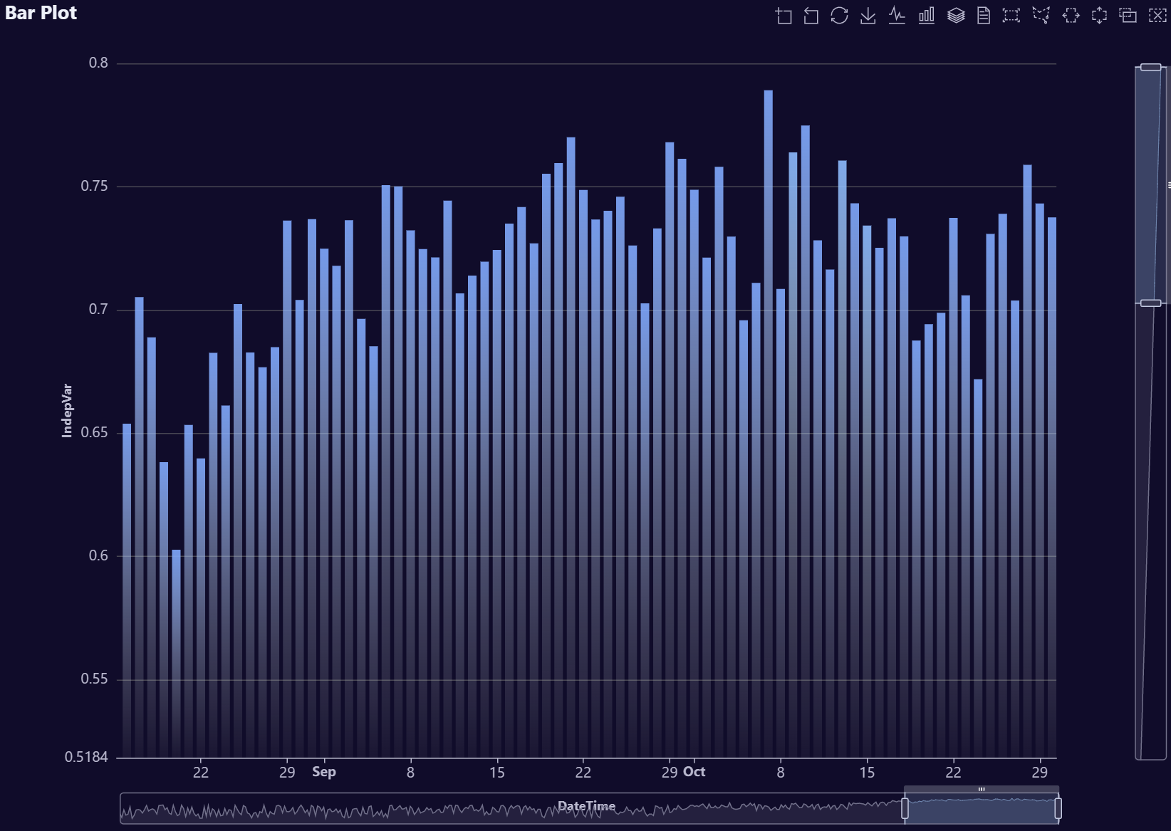
data <- AutoPlots::FakeDataGenerator(N = 100000)
# Echarts Bar Chart
AutoPlots::Plot.Bar(
dt = data,
PreAgg = FALSE,
XVar = "Factor_1",
YVar = "Adrian",
YVarTrans = "Identity",
EchartsTheme = "macarons")# Create fake data
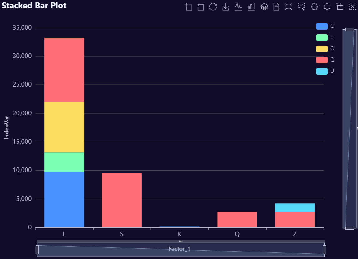
data <- AutoPlots::FakeDataGenerator(N = 100000)
# Echarts Stacked Bar Chart
AutoPlots::Plot.StackedBar(
dt = data,
PreAgg = FALSE,
XVar = "Factor_1",
YVar = "Adrian",
GroupVar = "Factor_2",
YVarTrans = "Identity",
EchartsTheme = "macarons")# Create fake data
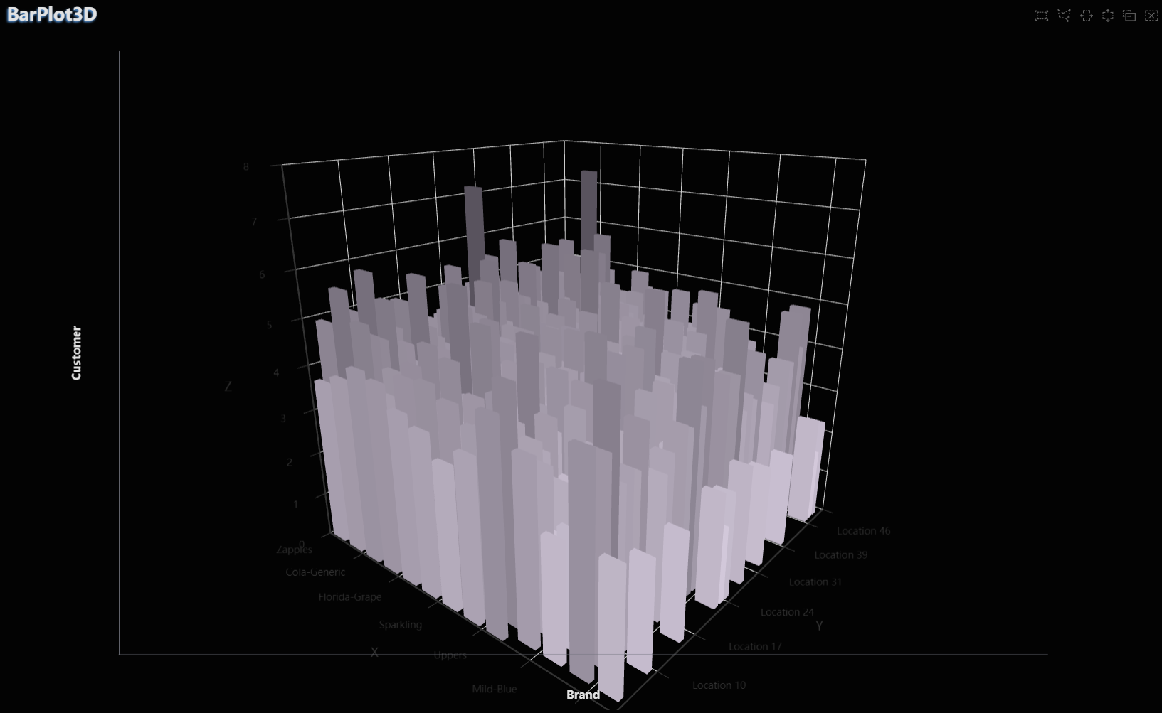
data <- AutoPlots::FakeDataGenerator(N = 100000)
# Echarts 3D Bar Chart
AutoPlots::Plot.BarPlot3D(
dt = data,
PreAgg = FALSE,
XVar = "Factor_1",
YVar = "Factor_2",
ZVar = "Adrian",
YVarTrans = "Identity",
EchartsTheme = "macarons")# Create fake data
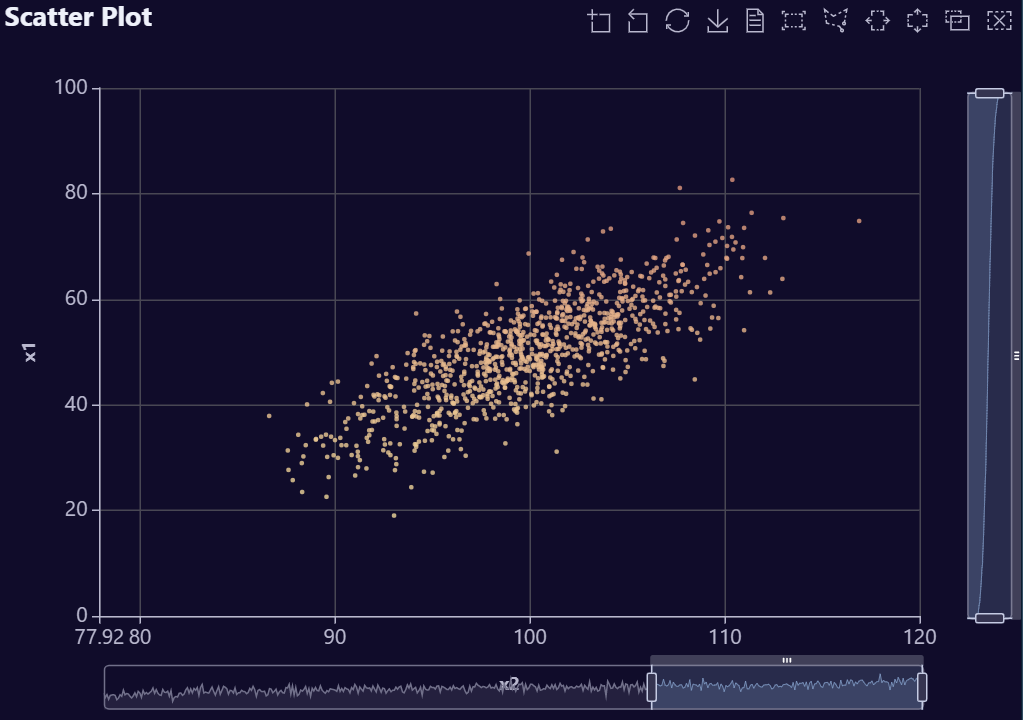
data <- AutoPlots::FakeDataGenerator(N = 100000)
# Echarts Scatter Plot Chart
AutoPlots::Plot.Scatter(
dt = data,
SampleSize = 10000,
XVar = "Adrian",
YVar = "Independent_Variable8",
YVarTrans = "Identity",
EchartsTheme = "macarons")# Create fake data
data <- AutoPlots::FakeDataGenerator(N = 100000)
# Echarts Scatter Plot Chart
AutoPlots::Plot.Scatter3D(
dt = data,
SampleSize = 10000,
XVar = "Adrian",
YVar = "Independent_Variable8",
ZVar = "Independent_Variable6",
YVarTrans = "Identity",
EchartsTheme = "macarons")# Create fake data
data <- AutoPlots::FakeDataGenerator(N = 100000)
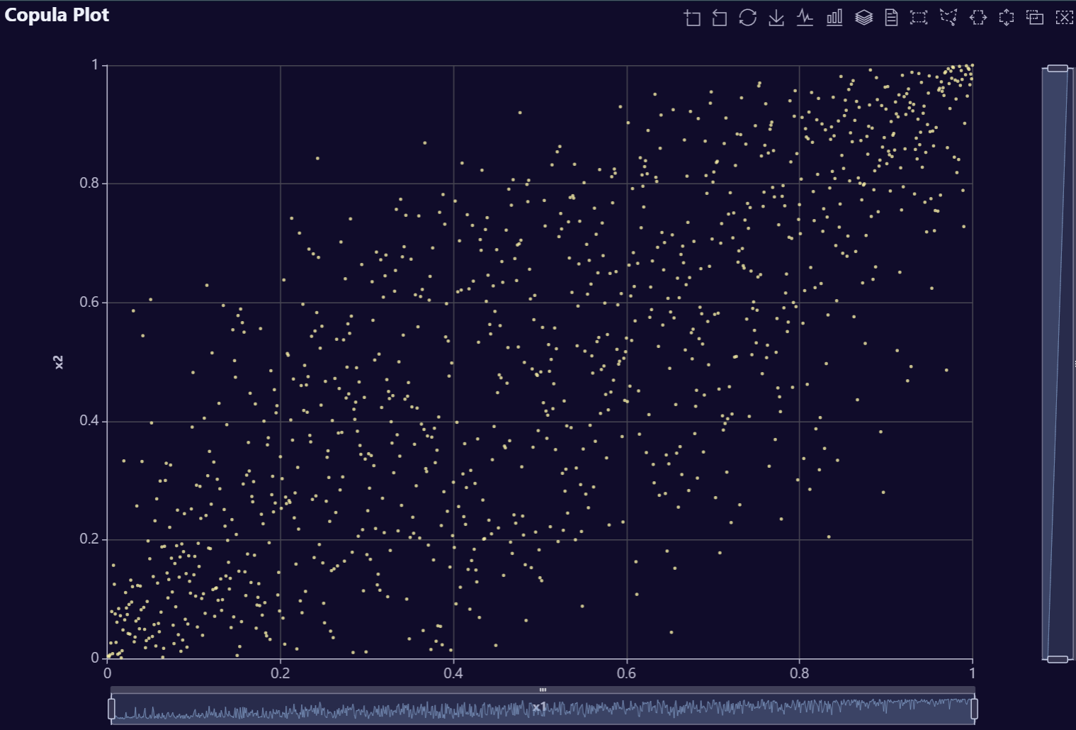
# Echarts Copula Plot Chart
AutoPlots::Plot.Copula(
dt = data,
SampleSize = 10000,
XVar = "Adrian",
YVar = "Independent_Variable8",
YVarTrans = "Identity",
EchartsTheme = "macarons")# Create fake data
data <- AutoPlots::FakeDataGenerator(N = 100000)
# Echarts Copula Plot Chart
AutoPlots::Plot.Copula3D(
dt = data,
SampleSize = 10000,
XVar = "Adrian",
YVar = "Independent_Variable9",
ZVar = "Independent_Variable6",
YVarTrans = "Identity",
EchartsTheme = "macarons")# Create fake data
data <- AutoPlots::FakeDataGenerator(N = 100000)
# Echarts Heatmap Plot Chart
AutoPlots::Plot.HeatMap(
dt = data,
XVar = "Factor_1",
YVar = "Factor_2",
ZVar = "Independent_Variable6",
YVarTrans = "Identity",
EchartsTheme = "macarons")# Create fake data
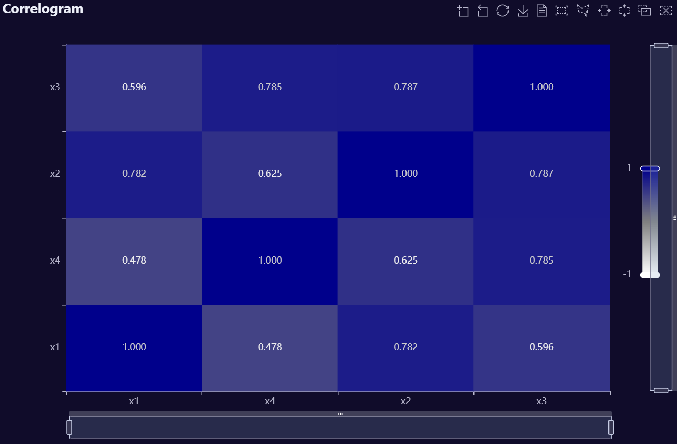
data <- AutoPlots::FakeDataGenerator(N = 100000)
# Echarts CorrMatrix Plot Chart
AutoPlots::Plot.CorrMatrix(
dt = data,
CorrVars = c(
"Adrian",
"Independent_Variable1",
"Independent_Variable2",
"Independent_Variable3",
"Independent_Variable4",
"Independent_Variable5"),
EchartsTheme = "macarons")dt <- data.table::data.table(Y = pnorm(q = runif(10000)))
AutoPlots::Plot.ProbabilityPlot(
dt = dt,
SampleSize = 1000L,
YVar = "Y",
YVarTrans = "Identity",
Height = NULL,
Width = NULL,
Title = 'Normal Probability Plot',
ShowLabels = FALSE,
EchartsTheme = "blue",
TextColor = "black",
title.fontSize = 22,
title.fontWeight = "bold",
title.textShadowColor = '#63aeff',
title.textShadowBlur = 3,
title.textShadowOffsetY = 1,
title.textShadowOffsetX = -1,
yaxis.fontSize = 14,
yaxis.rotate = 0,
ContainLabel = TRUE,
tooltip.trigger = "axis",
Debug = FALSE)